Our client, a global tech company based in Redmond, Washington, had advanced their cloud computing service to new heights in the landscape. However, as they have moved up the adoption curve into new markets, customer engagement started to drop, and free trial conversions slowed as a result. Customers further up the adoption curve needed to be presented with additional education and a simplified journey to a free trial. My team assessed their digital experience to identify over 90% of potential customer drop-offs in the conversion funnel and integrating those findings into a streamlined new design.
Date
January - April 2019
Agency
Revel
Team
James Watson, Creative Director
Joe Ehrbar, Copywriter
Marc Perez, UX Designer
UX
Though our client has a top-of-the-line cloud computing service, they were unable to convert consumer attention into customer retention. We started with an analysis of the most common user journeys, and discovered a dropoff of 73% of users before arriving at the free trial download page, and another 71% before the download and installation of the software. An increasingly small amount of users were even creating accounts and evaluating the software.
We strengthened our story by comparing the same free demo journey to other cloud providers and discovered some staggering differences. Our client had a longer average time spent registering a free account by over 2 minutes, and many of the metrics, like steps, clicks, and fields, were double the competition. There was nothing streamlined or easy about the process, and potential users were likely going straight to competitors for easier trials.

Visual Design
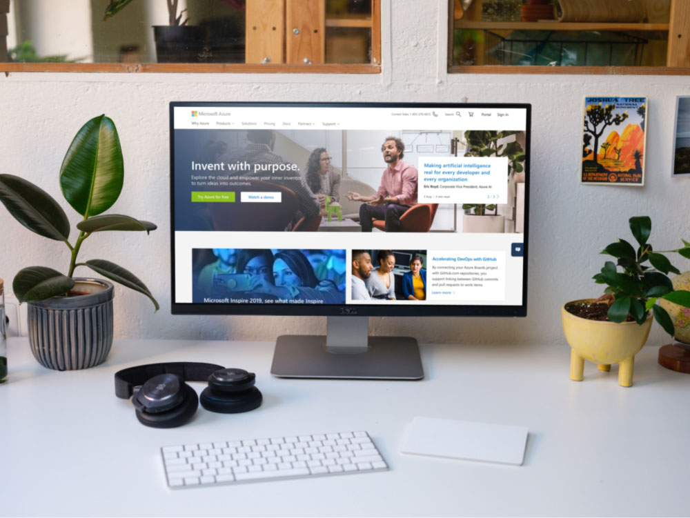
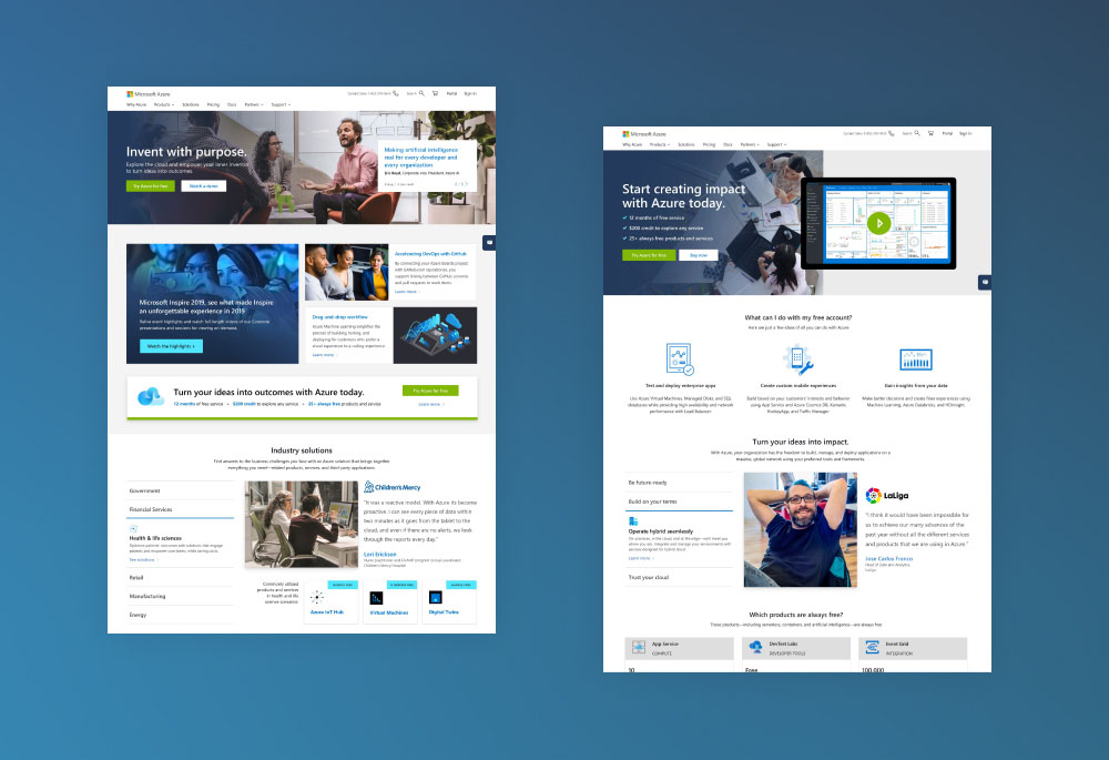
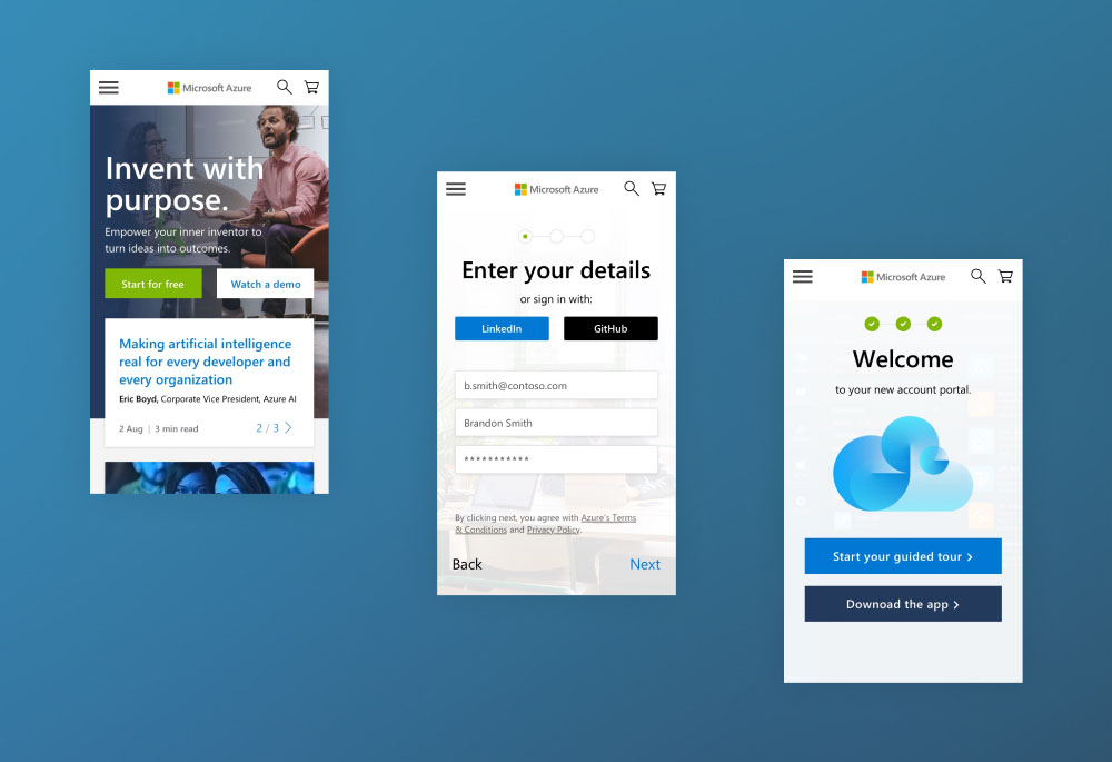
Our visual concepts leveraged the insights discovered in the previous UX audits and integrated a more conversion-focused orientation. We utilized messaging that embraced a wider diversity of user journeys, moving away from more corporate jargon to a humanist content strategy. Simultaneously, our components were designed to be lightweight, modular, and hyper-personalized after user data could be utilized.
The common free trial user wanted ease of demo access, so we raised the free trial CTA to the first screen load. We included space for video, demonstrating how the customer could quickly put the demo to use. We also created space for news and case studies that would generate appeal for specific audiences while also demonstrating the product's breadth of possibilities. By leveraging Github and LinkedIn for sign-in, we created a platform for customers to easily integrate their exponentially growing workflows.


Takeaways
Design is storytelling. This was one of the first reasons I was attracted to the work and continues to drive my enthusiasm. By working directly with CX Strategists and business leadership at my agency, this project showed me how impactful design can be an argument for better value. Taking real data gleaned from our client, my team was able to create a cohesive and resonant argument using a simplified user journey and streamlined visuals, aspects of which our client used in their strategic rebuilds over recent years.